FlingGolf: A New Startup & Sport Takes Flight

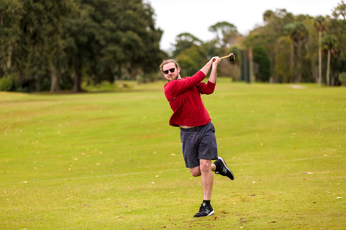
Our client New Swarm Sports, LLC is responsible for inventing a new sport for golf courses called FlingGolf. It’s a disruption of a long tradition, akin to the time when snowboarding first hit the slopes of traditional downhill skiing territory. Using what resembles a lacrosse stick with a customized head, a player cradles the golf ball before hurling it down the fairway towards the green. The player only needs one stick for all game play as the FlingStick can be used to fling as well as putt the ball.

Although a burgeoning sport, the company estimates that FlingGolf has been played on thousands of courses across the United States, Canada, in several European countries, Mexico, Australia and New Zealand.

Campaign Objectives: A Better User Experience and Branding

With momentum and awareness building around FlingGolf and the company’s commitment to scaling the sport, New Swarm Sports tapped Primary for a redesign of FlingGolf.com.


Before working with Primary, the FlingGolf.com site was built over the last few years, with content and functionality added over time. The site needed a new, streamlined user experience and interface that would drive sales of FlingSticks utilizing the Shopify platform.

FlingGolf also wanted to provide shopping tools that would enable greater customization, in response to consumers’ desire for personalized FlingSticks with branding from the NHL, NCAA, Military and more.

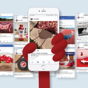
Our other goal was to redesign the site with our new brand look and feel to attract, educate and engage players and course owners to FlingGolf as well as launch an Ambassador program and build an online community.

Challenge: Quickly Outgrowing an Older Site

Before we started work, our audit revealed that the existing site had a lot of redundant, superfluous or hard-to-find content. Additionally, the site’s design did not reflect the company’s desired professional look for the brand and sport of FlingGolf.

As the vision for the company and the brand has grown, the site did not intuitively serve the various types of users and was missing key functionality New Swarm Sports need to scale and grow the sport. Beyond the technical challenge of building the site in 6-8 weeks, there was the challenge of branding a new sport, and there was the need to tell a compelling story.

Solution: Melding Form and Function

We were tasked with extending a Shopify template to accommodate custom assets, components and plugins that go beyond a strictly e-commerce function to which most Shopify sites are confined.

These components include an event calendar, build-a-stick and course finder functionality — all designed to facilitate a better experience for visitors to turn them into fans and players.

The Primary team were provided with very simple brand guidelines, and tasked with bringing the brand to life for the first time. Our branding work can be seen in the balancing of the color palette, image treatment, graphic elements etc.

Result: Fling On the Upswing

We launched the new site in time for the company’s major trade show season to enable course activation and sales. And we’re seeing a lower bounce rate, higher session duration, and more pages per session. But the best news is that our client is pleased with the results.

We were thrilled to work with the talented team at Primary,” said John Pruellage, President of New Swarm Sports. “They were great collaborators and problem solvers throughout the process as we explored different ways to shape the user experience for our consumers and golf course management customers. The team was agile and flexible, which allowed us to successfully launch the new site on a very accelerated timeline. We consider them valuable partners in our ongoing journey to grow the sport of FlingGolf.”

Fling Sticks on grass

Positioning the Merrimack Valley for Growth

The Merrimack Valley Planning Commission (MVPC) is a public, non-profit organization established in 1959 to assist the Valley’s 15 cities and towns in finding creative, sustainable solutions that address issues related to transportation, the environment, land use, and economic development.

While the MVPC has been around for 60 years, they are definitely not closing in on retirement. Instead of slowing down, they partnered with Primary to help breathe new life into a region that’s evolving it’s next identity with a new website, foundational brand assets, and messaging to help attract business to the region.

The Challenge: Lots of Deciders

The assignment was to build a messaging platform that excites, inspires and motivates an audience to join a revitalization of a vast and diverse region, all while making sure it served the interests of all the key stakeholders who have really high standards: the 15 mayors of the Merrimack Valley.

The Solution: Personalizing the Story

Understanding the Audience

MVPC partnered with Primary to strategically navigate toward their goal by first making sure they understood not just who they should be talking to, but how and where to begin those conversations.

We created a roundtable – consisting of local and state government staff, private companies, and non-profit organizations – to vet the assets, challenges and unappreciated qualities of the Merrimack Valley. To understand why the region is a great place to do business, we conducted interviews with nearly 40 stakeholders representing local businesses, Chambers of Commerce, business associations, non-profit organizations and entrepreneurs to determine existing attitudes and perceptions of the Merrimack Valley Region, as well as the opportunities and challenges to enhancing the region’s image.

Primary uncovered the commonalities through brand research and then strategy and positioning to unite the Merrimack Valley ‘Here for the Making’ to promote the manufacturing roots and crafted personalized success stories by hometowners to attract other hometowners to come back and do business in the place that they know and love.

Unifying with a Singular Position

Primary developed a unifying platform for all that rings true to the region’s DNA of homegrown, solo-preneur, and entrepreneur makers: the optimistic position that Merrimack Valley is Here for the Making. Our storytelling platform, that “Knowledge Runs Deep in the Valley,” enables our audience to hear about the obstacles to success from those who’ve blazed the tough trail before.

A New Online Hub for the Valley

Image of MVPC Website

We took economic development to a new level by creating an all-encompassing website at wearemv.com and brand that promotes business resources; priority development areas; unique assets in each community; for lease/sale properties to grow existing and start new businesses; and data that will help businesses make smart decisions about how to be successful in the Valley.

Because the tools embedded in the site were such high priority, we redeveloped the property search tool from the old site. We fully redesigned and redeveloped this tool to provide searchable map view and table view, to use 360-degree aerial photography, and provide detailed listings for every available property.

Original Storytelling

We dialed up storytelling on the site by authoring several long-form articles with original photography and videos that included insightful interviews with successful startups. One business owner featured on the site, Peter Russo, president at Blackburn Energy, had this to say about our storytelling: “Primary provided compelling videos and copy for the MVPC website that features our startup as a success story. It’s clear that Primary understands how to capture a story in mediums for a B2B audience.”

Results: Growing Community Online

In this comprehensive campaign, we delivered industry-leading solutions to client pain points on all fronts: rebranding, repositioning, content strategy and marketing, SEO strategy, high-end web design and full-stack web app development. To date, site traffic is up 300% and new visitors are up 500%.

But beyond the initial stats, what matters most is that the campaign has been embraced as strategically smart, creatively provocative, and functionally rich by many constituents, enabling MVPC to become a go-to resource for the knowledge and tools needed to be a successful part of the rebirth of the region.

MVPC Billboards

Putting Boca Raton Innovation Campus on the Map

A Storied History and a Bright Future

Designed by iconic architect Marcel Breuer, BRIC (Boca Raton Innovation Campus) was IBM’s North American R&D facility in the 1960s, and today, at 1.7 million square feet, is the largest single-office facility in Florida. Home to the invention of their first personal computer, you could say that the future began there.

Determined to keep that spirit of innovation alive, our client Crocker Partners is currently evolving BRIC into a technology hub with the addition of a STEAM (Science, Technology, Engineering, Arts, and Mathematics) Lab, wellness center, tenant lounges, state-of-the-art fitness studio, event space to host large-scale coding camps and trade shows, on-site daycare, 1,200-seat campus dining room with Bistro cafe, and newly-renovated conference centers in close proximity to public transportation.

The Challenge: Making Big Feel Manageable

Crocker Partners, in a joint effort with Siguler Guff and Rialto Capital Management, purchased BRIC for $179.3 million in the biggest office sale in the tri-county region since 2016. Crocker wanted to position BRIC as a premier science and technology hub in the state of Florida, a destination for the community in addition to office space. But at the time there was little  awareness of BRIC online, and not even a website to find it.

Moreover, because BRIC is situated on 123 acres and the building exterior looks the same from many different angles, it can be difficult to navigate for visitors, and even current tenants didn’t know who their neighbors were. How could we solve for these very real offline challenges with online solutions?

The Solution: A Better User Experience

Crocker Partners contracted Primary to create a functional website with a dynamic map that would serve both existing and prospective tenants and guests; to communicate the campus’ many amenities; and house it all in an innovative design that would match the innovative location.

Paper wireframe sketch to high-fidelity prototype comparison

We determined that an interactive map would be the key to accessing BRIC. We held an interdepartmental User Experience workshop for our 3D visualization, design, web development, and creative teams to explore how an ideal map experience should feel.

We ultimately chose to render the campus in 3D, and then overlaid each building with a vector object, enabling users to click on each building and identify tenant locations on multiple floors. Unlike a standard Google Map, our custom-developed map helps you travel around campus through a search field and a legend that pinpoints all amenities.

Every amenity gets the spotlight on the site with compelling visuals and copy, and accessing the amenity portal, where employees can reserve meeting spaces, sign-up for the fitness center, and place service requests, is seamless.

Our web design drew inspiration from the campus’ architect, Marcel Breuer, whose Modernist vision came to life in Y-shaped concrete support columns along each building’s exterior that resemble trees, which also help withstand a category 5 hurricane. Just as the tree-like columns would serve as the foundational element of the building’s integrity, so too would they support our website’s visual theme, as witnessed in the form of subtle animations and angular shapes containing content.

The Result: Form and Function United

According to Gianna Pacinelli, Marketing Director at Crocker Partners, “We didn’t have much of a vision or expectations for what we wanted BRIC’s website to look like. We just knew we had problems that needed to be solved. Primary helped us weed through the options and moving parts to put together an organized and interesting launchpad that identified both the past and future of BRIC.”

Like BRIC itself, the new website is built for future expansion. And as BRIC grows, Crocker Partners has the ability to add more information to the website ongoing themselves, including news, tenant information, amenities and more.

BRIC homepage displayed on an iPad

5 Secrets to Successfully Rebranding Multifamily Communities

Imagine you’ve purchased or own a multifamily apartment community that was built when Ross and Rachel were a thing, and it hasn’t been updated since the Friends finale. Updating the clubhouse, investing in state-of-the-art amenities and finishes, and hiring an interior decorator are the obvious fixes. But, just like a tie makes the suit, the logo of a multifamily apartment sets the entire tone of the community, providing the flair and personality it needs to stand out in the neighborhood and among the competition.

Whether you need to create a new brand or update an existing one, your new kid on the block needs to feel fresh to renters, but it also needs to feel authentic to the local market. How do you maintain that local authenticity while creating something new? The answer is great design.

Our client, a private real estate investment company focused on value-add apartment opportunities with a portfolio of thousands of units in secondary western growth markets, came to us with the challenge of rebranding two outdated multifamily communities built in the 90s.

Our makeover to their communities included:

  • Rebranding: A new look and feel, logo design, positioning tagline, story, and stationery
  • Brand Guidelines: A comprehensive brand book with usage instructions
  • Collateral and Signage Design: Brochure, rack card, and labels, markers and directional signs for buildings, apartments, and parking.

To successfully produce these materials, we followed our proven method for multifamily community rebranding, and we’re sharing our 5 secrets so you can produce something new and avoid a rerun.

Too busy to read on?

Secret 1: Do Your Homework

Who’s your audience? What sets you apart from the competition? What are your goals? These questions and more allow us to gauge exactly what you, the client, are looking for. By answering our Rebranding Survey, you provide us with an in-depth understanding of the history and planned future of the community. If we don’t know where you’ve been, how can we help get you to where you’re going?

Secret 2: It Takes a Village

Next, we set up a call for all stakeholders to elaborate on their questionnaire responses and add any relevant information. It’s essential to do this in a group setting so everyone aligns on the answers. In the case of our client, we involved their interior/exterior designer who oversees renovations for both communities. We found her mood boards to be extremely beneficial, and before we embarked we already had a clear understanding of the vision for both communities, ultimately leading us to create identities that matched their new physical appearance.

Secret 3: Get It In a Brief

We’re in the business of creating transformative ideas — ones that change perceptions and attract new audiences. Our Creative Brief helps us get to the big idea that supports the identity when applied to all marketing materials. As our North Star to be tacked on the wall, the brief provides a framework to define language, color choice, and consolidates all of your inputs so we have the right output.

Secret 4: Find Your Unique Voice

The approved brief is handed off from our account strategy team to the creative team of art directors, designers, and copywriters. This team works in lock step to explore solutions that articulate the brand in its best light, knowing that choices in messaging impact choices in art and vice versa.

The target for Vista at Trappers Glen is a young, active audience that enjoys hiking on weekends and the Denver nightlife. This key insight lead our copywriter to the positioning line: ‘Adventurous by Nature.’

The Silverlake Apartments was in need of a new name, but our client wanted it to be associated with the neighborhood lake, an amenity for the community. This informed insight inspired the new name, The Lakehouse, and a strong call to action in the positioning line: ‘Meet Us By The Water.’

Secret 5: Design (and Design Again)

As the communities’ messaging was under development, our art directors and designers worked through iterations of each logo that followed the positioning lines. For our initial presentation, we present a minimum of three logo concepts with all our clients. After the client approves a general logo direction and positioning line, we then refine them through to completion, adjusting design, color, and tweaking until we’ve reached the final identity and brand voice. Our art directors explain their vision for each community:

VISTA AT TRAPPERS GLEN

“One of the property renovation goals was to make the community more inviting, encourage an active lifestyle, and foster a sense of shared community space. We captured those goals in an ownable mark that drew inspiration from the Red Rocks area – ideal for an active, outdoor lifestyle and home to some of Colorado’s most beautiful natural landscapes.”

community branding imagerycommunity logo design processmultifamily logo vista at trappers glen multifamily logo vista at trappers glen


THE LAKEHOUSE

“In our visual exploration and research of the Silver Lake area, we discovered the topographical contour map of the lake itself and found that it could serve as a base for a versatile identity that lent itself to all different media. The final logo embodies the lake’s physical dimension but also evokes a sense of rippling water.“

multifamily logo process the lakehouse multifamily logo variations for the lakehouse community rebranding imagery for the lakehouse multifamily logo design for the lakehouse

The final identities now apply to the campaign deliverables and can be used on the website, for advertising, and social media. Now, the tie has made the suit and doesn’t feel like Ross’ dinosaur tie.


5 Essential Steps for Designing a Website

PRIMARY recently designed the website of real estate client Woodmont Properties – a New Jersey-based company in business for more than half a century that develops, builds, markets and invests in a diversified portfolio. The challenge was that their web design wasn’t keeping pace with their growing business, lacked a custom design, and had a dated look and feel. Sound familiar?

Read on to learn how we used our proven five-step process to effectively build a website for Woodmont, and how this framework could be applied to your next web project.

Step 1. Research

All brands are unique, and for your brand, as well as for Woodmont, our first step is the same: asking questions to learn about business needs. By having clients complete the PRIMARY Website Project Survey, we’re able to focus our efforts on what is essential, and create a custom project brief.

After this scoping exercise, our team develops a deeper understanding of the industry landscape by compiling a list of your direct competitors and examining their website strategies to learn from their successes and failures.

We then perform several deep-dive audits of your existing website and summarize our findings to highlight areas of improvement to the SEO / content strategy, performance, and functional usability of the future website.

To achieve success we first have to define it. In Woodmont’s case, we determined three success metrics: increased site traffic, longer time spent on the site, and more frequent contact form submissions. With the old site’s data collected, we had our benchmarks and a strategy to exceed them.

web design process step 2 - plan


Step 2. Plan

For your website to convert users into customers, it is necessary to understand the needs of your target audience. Armed with insights, our writers and strategists optimize the copy to message them effectively.

Once Woodmont’s target audience and site goals were defined, we understood that improving Search Engine Optimization would be critical. Based on our audits from step one, we set out to improve Woodmont’s rank in search engines.

We then determine the ideal information architecture and desired User Experience (UX) for the upcoming site design. For Woodmont, our site would serve up content as a single-page experience, with a few inside pages to browse the company’s extensive News and Awards content.

The homepage would then seamlessly integrate the Introduction, About, Leadership, Portfolio, and Careers sections of the site. This contrasted greatly with the original site that made browsing more difficult for visitors.

Step 3. Design

With the research and planning all mapped out, our design and development steps commence simultaneously. This agile workflow involves the client early and often to accelerate the completion of our web projects.

Now our design team produces user-centered solutions to achieve site goals and meet functional requirements. We refine the visual design as the client reviews functional prototypes, providing feedback and approval along the way.

web design process step 3 - design

Step 4. Develop

While the web design team worked on user interface and art direction, our developers started on the site’s back end and core functionality. We plug content and images into the database, and set up the admin dashboard of the Content Management System (CMS) so that clients can update content quickly and easily.

Our web development tasks for Woodmont included the creation of a customizable Portfolio section of nearly 150 investments across five categories, with the ability for visitors to sort by Property Type and filter by current status (now leasing, coming soon).

Woodmont website portfolio redesignWe ensured the web design was mobile-friendly to look and perform well on all devices including tablets and smart phones.

Before proceeding to the site launch, our team tested the site thoroughly for any bugs/errors, broken links, browser compatibility quirks, or content needs.

Step 5. Launch (and Beyond)

Prior to launching the site, we crafted Woodmont’s announcement strategy to make a splash. We created posts to target their social media followers, and an HTML e-blast designed to drive relevant traffic to the fresh homepage.

As their online presence thrives, we’ve been able to improve site metrics further by reviewing analytics with remote user tests to optimize the site’s design, conversion rates, and ongoing performance.

Woodmont website homepage redesign

Woodmont is now a long-term client of PRIMARY, and we’re here for them any time they need design or functionality updates to ensure that their web presence is constantly the best it can be.

“My experience working with PRIMARY has been refreshing. Working with such a creative, solutions-oriented full-service agency has transformed the way I run my marketing department. I no longer have to rely on different vendors for each one of my needs. PRIMARY is made up of true professionals and I feel confident that our success is their number one priority.”

Chris Camy
Marketing Manager
Woodmont Properties

Whether your site’s web design needs a minor update or a major overhaul, we invite you to take our Website Project Survey and start a conversation with us.

Now We’re on a First Name Basis

“There are those that look at things the way they are, and ask why? I dream of things that never were, and ask why not?” – George Bernard Shaw

This famous quote captures the spirit of the rebranded PRIMARY. After three decades operating as Primary Design, we took stock of what we have become as an organization, and dreamed ourselves into an agency without limits. By dropping our last name, we’re making a statement about the singularity of our nature.

Design is still a central part of our DNA, but it’s on an equal footing with our Strategy, Visualization, Web Development, Creative, Media and Analytics services. Many of our clients want one, all, or a mix of our services, so we incorporate them into a holistic, integrated marketing agency with a 360-degree approach.

Our new logo embodies our core value of engagement. It acknowledges that our clients may come to us for answers, but what they get is open and honest dialogue. We ask them difficult questions that take them out of their comfort zones to break down bias.

We believe in the transformative power of questions. Questions reveal truths. Truths lead to insights. Insights lead to plans. Plans to actions. Actions to outcomes. We believe that to transform anything, you have to question everything.

This website is a reflection of our philosophy. Visitors are greeted with questions they may have, and we showcase our services and relevant work that addressed similar challenges.

Years of branding and rebranding our clients have taught us a lot, and we know it’s not easy to change. One thing should be clear: We work to change perceptions, to change beliefs, and to change possibilities. Our business is transformation. We apply an artist’s eye for detail to a cognitive scientist’s appreciation for what motivates people.

We hope you enjoy the new look and feel of PRIMARY.

Dream big!

Branding a New Cranberry Juice Line

Challenge: Standing Out in a Crowded Market

How could Bluewater Farms, a traditional farming operation that has been growing cranberries on Cape Cod for three generations, roll out several new cranberry beverages in 2018 and succeed in a crowded beverage market?

The answer: By appealing to both the health-conscious and those who demand great taste.

As a superfood, cranberries check the box on health benefits, containing proanthocyanidins (PACs), powerful antioxidants that may help prevent a range of diseases. But possessing an incredible ingredient is just the start. Bluewater Farms acknowledged the need to blend the natural tartness of cranberry juice with other natural flavors to reach a broader market with sweeter palettes.

Branding: Position and Personality

We developed a new “Crancrafted” brand positioning – a melding of hand-crafted and cranberry – that celebrates the intensive work that goes into harvesting each berry from the bog. We incorporated that message into a refreshed Bluewater Farms identity, linking the brand name to its core value.

We then created Cranman to serve as our brand ambassador. The ultimate superfruit; he’s charged with being the defender against free radicals, out to do right by your body. A responsibility he embodies as one kick-ass tiny fruit with, you got it, super power.

Website: Every Hero Needs a Home

Like all superheroes, ours needed a fortress of solitude to call home, or in our case, a website. Primary’s web development team created an experience that heightened the work of our design leads. Approached thoughtfully, it enhances the vibrancy of Cranman through timing, animation and interaction.

The solution maintains the fidelity and relative proportion of the images, while serving a search engine and browser optimized experience, to create a beautifully responsive site.

Content: A Social Star Is Born

Our social storytelling shares the saga of Cranman to deliver ongoing awareness and engagement for our hero and product. We’re driving consumer attraction through shared interests, focusing on contextual, cultural content that aligns with a community of health and foodie influencers.

Our engagement strategy involves consumers in conversations that are both entertaining and informative. For instance, to reach an audience obsessed with sports, we created the #SuperFruitBowl that pitted the New England Cranberries against the Philly Kiwis. These characters scored TDs, got blended by the blender referee, and were tackled in sync to the actions on the field at Super Bowl 52. For the Winter Olympics, we created a series of postcards and videos from home to support all of the Massachusetts-based athletes on the men’s and women’s hockey teams. We even created a portrait of star Meghan Duggan in cranberries! By sharing all of this content across the Crancrafted Twitter, Instagram and Facebook profiles, we earned a ton of new fans and followers, high engagement, greater reach and impressions.

Primary has gone above and beyond expectations. From developing a powerful compelling persona, designing our packaging, crafting an online home and helming ongoing storytelling, Primary delivered on all our needs. We couldn’t have asked for a better agency partner to bring our brand into the modern marketing era.”

— Brendan Moquin, Managing Partner, Graystone Limited LLC (parent company of Bluewater Farms)

Cultural Branding Matters Now More Than Ever

Brand Culture Speaks Volumes

Today, what a brand does matters as much as (if not more than) what a brand says. It’s not enough to talk the talk; successful brands need to walk the walk and live their values to be purpose driven. Clearly, in a cultural branding climate where Lyft can grab more market share because of misogyny at Uber, consumers are voting with their dollars based on how brands act, and not just based on what they say.

If it seems like this should be obvious, then why do we still see brands sloganeering instead of making real change happen?

Within the space of a week, the New York Times published two stories that underscored this point. In “Can You Draw the Starbucks Logo Without Cheating? Probably Not” they reported that, in a study by Signs.com of 156 participants asked to draw the logos of iconic brands from memory, a miniscule percentage could do it.

So Much Noise, Not Enough Signal

Perhaps, they surmised, the cause was “inattentional amnesia” a phenomenon that when something is seen repeatedly, the information ends up being more easily ignored or forgotten. I can’t speak for everyone, but inattentional amnesia sounds like a pretty good term to describe my current state of mind.

I find myself needing to ignore the latest marketing messages programmatically beamed to all my devices for the thousandth time, and needing to emotionally gird myself for the next media onslaught coverage of the latest harassment case, Trump headline, and mass shooting. It’s not that I care less now. It’s just that because I have less time, and because I am receiving messages repeatedly, they’re much easier to ignore to get through my day. That’s inattentional amnesia.

Brands know this. So rather than focus on messages alone, they’re taking stands in the culture wars. In “Pizza is Partisan, and Advertisers Are Still Adjusting” the Times reported on the social media backlash against Papa John’s, Keurig and Jim Beam for wading into controversial territory with their actions.  The conclusion: it may be impossible for brands to not take a position on core values in such a politically charged climate.

How Brands Can Adapt

So, if brand messages are ignored, and brand action matters now more than ever, how should brands find resonance with consumers? The Ad Age article “Four Pillars of the Modern Brand Identity” points the way forward. The author states: “modern brands don’t hand off the attributes of their brand identity to media. Instead, they build their identity in their networks, one experience at a time. They are identity networks. Modern brands are less about the company that created products and services, and more about the individual who buys them.”

To combat bullying, Burger King crafted the culturally relevant Bullying Jr. video and seeded it on all social platforms. On International Men’s Day, Harry’s, the razor company, took out a full-page print ad in the NYT, and shared social content asking us to question the meaning of this holiday (see below). On Black Friday, REI yet again provoked us to not shop, but to #OptOutside instead. These are just a few examples of companies demonstrating that cultural branding is having a moment. The posturing and actions of companies will not be ignored (for now).


Driving Action Begins with the Heart: How We Helped “Give Play for Good”

Accepting The Challenge

When Greensboro Children’s Museum came to us, they asked for a fundraising concept to increase donations for an annual drive. The museum had been in its community for 18 years with a mission to connect with parents, teachers and educators through hands-on learning through play. With a new outdoor play plaza, Edible Schoolyard garden and cooking school, the Greensboro Children’s Museum prizes engaging experiences and is nationally recognized for its success.

The challenge before us was, first, how to grab audiences—parents, like-minded organizations and other local supporters, with an emotional hook. We knew this was the key to drive engagement with the community, drive brand awareness and activate donations.

From Strategy to Action

We strategized and built our plans on the insight that play is a value that will carry a child through life. To support this idea, we developed Give Play for Good, a marketing campaign demonstrating the power of play in unexpected and everyday ways. The campaign included:

  • A Donation Page at giveplayforgood.org
  • Three Broadcast PSAs (viewable at the donation page)
  • Email and direct marketing
  • Social media content creation
  • Digital ads on social networks

“The launch of our new outdoor play plaza was part of our capital campaign and was introduced in May,” said Althea Hall, marketing director at Greensboro Children’s Museum. “The combination of everything Primary did with us delivered a halo effect for that project, and made a big impact overall for our organization. We had so much engagement with the social content that Primary developed, that it really drove awareness like never before. I loved that we had a total 360 of our messaging grounded in the foundation that Primary developed with us, and firing in sync on every platform.”

The Results Are In

And the results have been nothing short of astounding, with GCM reporting:

  • 48% year-to-date increase in GCM memberships and walk-up admissions sales
  • 2017 GCM summer camp program sold out
  • Paid programs including GCM’s Edible Schoolyard cooking school programs, which continue to sell out
  • Green Acres Gala fundraiser sold out

One of Primary’s core beliefs is giving back to communities and spreading good. Most recently, we have worked to create a pro bono site for HomeStart’s Renew Collaborative a non-profit dedicated to preventing evictions, and created Bell Hurricane Relief, for Bell Partners to assist employees following the hurricanes in Texas and Florida. We’re looking forward to more good deeds with our clients in the future. What else can we all give for good? Contact us for ways we can partner on transforming single acts of giving into bigger missions for a better life.

Shining Light onto Dark Social

Imagine you’re browsing through the web and come across a job opening at an ad agency. You remember your friend is looking for work so you copy and paste the link into an email to her. She gets your email and opens the link. You’ve both just engaged in dark social.

What is Dark Social?

The term “dark social” has been around several years. And though the behavior keeps growing, we still don’t hear about it much. Hootsuite has listed, it’s content shared through private channels like:

  • Direct messages on platforms including Twitter, Instagram, Snapchat, Facebook
  • Messaging apps such as WhatsApp, WeChat, Slack, Facebook Messenger
  • Secured browsing such as clicking from http to HTTP
  • Text messages and emails

For example, when you publicly share a link on Facebook, it appears on your wall, your friends’ news feeds and displays all of the reactions, comments and shares the post received. But, when you share the link through one of these private channels, it becomes a closed conversation. You could say, that content went dark.

What Does This Mean for Marketers Like Us?

Since links carry referral traffic metadata, public social sharing lets us see where site visitors are coming from. It’s how we track whether campaigns are working and get valuable data to support marketing spend.

But private online chatter (i.e. dark social) is tough to track. Visitors who follow your website link from a dark social share look like they have typed the link directly into their browser. The metadata that would’ve been attached to the link is no longer present. There goes our valuable data tracking.

It’s not all doom and gloom though. Dark social presents a great marketing opportunity since peer-to-peer shares are more trusted. For example, if a friend recommends a brand of clothing and forwards you a link to their online store via a private message, you’re more likely to visit their website. Whereas, if you saw a general ad about the same website, you might be less inclined to click on it. As Social Media Examiner describes, “When your customers engage with one another or even your business through a direct message, the interaction is private and far more effective, intimate, and targeted.”

Even though public shares allow more widespread visibility, a shared link through a private app is still—and sometimes more–valuable engagement. We just have to figure out how to track it.

How Do We Identify Dark Social Traffic?

There are a few ways we can track this activity or influence the way audiences will interact with our content. Here are a few recommendations from AdExpresso:

  • Create a custom, direct-traffic segment in Google Analytics, excluding shorter length landing pages. By excluding these shorter URLs, only longer URLs will remain. The longer a URL, the more unlikely it is that the user would have typed it out. This will allow you to estimate the percentage of direct traffic that comes from a privately shared URL.
  • Link shorteners, like Bitly or Ow.ly, are a low-tech way to track and analyze engagement rates. Instead of copying and pasting a long link, shortened URLs may encourage people to share them because of their condensed and cleaner appearance on platforms.
  • Provide opt-in monitoring with incentives. If your brand page is likely receiving dark social traffic, offer visitors a free coupon or white paper and ask the visitor how they found your website.
  • Make sharing buttons more accessible. If a visitor shares via a button, you’ll still be able to measure the referral data. Either provide the buttons at the bottom of a post or have them clearly identified for “following” or “sharing” on the page. You can also provide a wider variety of button options. ShareThis is a customizable tool that enables sharing through channels like WhatsApp or text messaging.
  • Explore dark social tracking tools. Po.st provides options like automatic Linkback URLs, ShareURL tracking and pop-up sharing buttons when copying text. GetSocial.io is a social media app store where you can create an account, use their provided code on your website, and use the Address Bar Tracking app.

While messenger apps are on the rise, detailed visitor information for dark social probably won’t be available for some time. As marketers, we should be knowledgeable about how it works, know the ways to recognize how it is affecting our campaigns and have the appropriate tools to combat the loss of referral traffic data that comes with dark social.


For more on this, and other marketing tools, contact us.